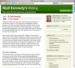
Feb07

Site redesign complete!

The new hotness

I've been a bit quiet over the past week while making some changes under the hood of this website. This morning I unveiled a new site design I hope will convey a more professional look and experience for everyone viewing my pages in a web browser.

I wanted to add more visual structure to each post to match what I try to accomplish in my markup. I wanted to help visitors discover new sections of the site and click around a bit to learn more. I also wanted to improve the friendliness of search and commenting.

I worked with Mike Rundle of Business Logs to turn some of these ideas into a visual reality. Mike and I share interests in exposing more quality content created by passionate individuals. We both like to think of the browsing experience across multiple devices from a home media center all the way down to a mobile handset.

I hope you like the new design! I still have a few tweaks and cosmetic finishes to apply but so far I am liking the new hotness.

Tags:

17 Comments

Commentary on "Site redesign complete!":

Subscribe to new comments

  1. om on February 7, 2006 at 7:18 PM wrote: #

    niall, this looks really really hot. nicely done. mike is a good designer and does an awesome job.
  2. Randy Charles Morin on February 7, 2006 at 7:21 PM wrote: #

    Looks awesome!
  3. Stephen Pierzchala on February 7, 2006 at 7:47 PM wrote: #

    Niall: Nice. Almost as hot as my updated Newest Industry. smp
  4. Frank Gruber on February 7, 2006 at 8:16 PM wrote: #

    Great job with the redesign...it is sizzling it is so hot right now. I like the green too.
  5. Cameron Bulock on February 7, 2006 at 8:18 PM wrote: #

    Love the look! If I ever learn some visual design, I'd like to do something like this.
  6. Dave on February 7, 2006 at 10:20 PM wrote: #

    nice job dude! (and very recursive-looking post -- does it keep doing that if i keep clicking? ;)
  7. Ted Rheingold on February 7, 2006 at 10:48 PM wrote: #

    Killer entry title, date, and categories design combo. Great color usage and gradients overall. Great font face and color choices. Yet the entry itself still remains the focus even though it's on a borderless white area so that's very nice. Consider nixing the vertical white space between the posted/comments bar and the beginning of the actual comments. Consider moving the adsense ad so it abuts it's 'Advertising' header above. In fact consider nixing the 'Advertising' and showing the google block (as it clearly says 'Ads by Google'). Maybe one day you'll have your own inventory of image ads and will need the header back, but until then consider removing the 'Advertising' header or 'Ads by Google' header. Also if you can stretch that adsense box to 300w you'll be displaying their best performing ad option. But really, it's a very clean, fresh and warm design.
  8. Lee Wilkins on February 8, 2006 at 12:36 AM wrote: #

    Nice redesign Niall...... Like it a lot
  9. Guillaume Champeau on February 8, 2006 at 5:59 AM wrote: #

    Awsome Niall, I love it. Nice colors and a great header. Thumbs up!
  10. Simone Carletti on February 8, 2006 at 7:54 AM wrote: #

    WOW Niall, it's wonderful! Mike Rundle has create a great look.
  11. Mike on February 8, 2006 at 9:08 AM wrote: #

    Wow, great to see all the positive feedback guys :) I think it has some small quirks in IE6, but those will be squashed momentarily. Ted - You brought up some great points, especially about the vertical spacing, I'll jump into the CSS and see what I can do.
  12. Tom Bridge on February 8, 2006 at 9:12 AM wrote: #

    Very nice work, Niall!
  13. Anil Dash on February 9, 2006 at 1:12 AM wrote: #

    Nice! Looks like a million bucks -- I might use the standard feed icon next to your subscribe link, but the rest is really clean and nice.
  14. Cris Pearson on February 9, 2006 at 8:13 AM wrote: #

    Very nice guys!
  15. Kyle Bunch on February 9, 2006 at 5:58 PM wrote: #

    I knew it looked Rundlesque. At a time when everyone seems to be using rounded edges and fade outs, Mike still manages to take those elements and make them thoroughly his own. Great job guys. This rockets right up to upper eschelons of the hottest-looking MT sites, for sure.
  16. Brian Breslin on February 10, 2006 at 8:49 AM wrote: #

    very nice design, BIG improvement. good work to everyone involved.
  17. Paul Stamatiou on February 10, 2006 at 12:09 PM wrote: #

    Another Rundle masterpiece!

Add a comment

Some comments may be placed in a moderation queue to ensure topical relevancy. You may contact author Niall Kennedy directly if you prefer to comment privately.


(not published)


Niall Kennedy Niall Kennedy is a web technologist in San Francisco, California in the United States. I am very interested in the world of... MORE »

Search this weblog:

Subscribe:

Recently Popular

Archives: Popular Categories